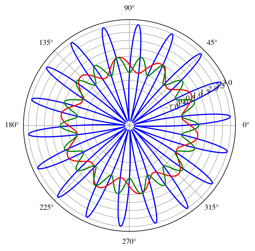
Polar Axis
For a demonstration of a line plot on a polar axis, see Figure 1.
Code
import numpy as np
import matplotlib.pyplot as plt
theta = np.linspace(0, 2*np.pi, 1000)
r = 3* np.sin(18 * theta)
r1 = 0.5 - 0.5 * np.sin(10*theta)
r2=0.5+0.5*np.cos(18*theta)
#plt.polar(theta, r, 'r')
#r = np.arange(0, 2, 0.01)
#theta = 2 * np.pi * r
fig, ax = plt.subplots(subplot_kw={'projection': 'polar'})
ax.plot(theta, r,'b')
ax.plot(theta, r1,'r')
ax.plot(theta, r2,'g')
ax.set_rticks([-1.0,-0.5,0.0,0.5, 1, 1.5, 2, 2.5, 3.0])
ax.grid(True)
plt.show()
XARRAY
::: {#cell-xarray plot .cell execution_count=3}
Code
import xarray as xr
import numpy as np
import matplotlib.pyplot as plt
import cartopy.crs as ccrs
from matplotlib.animation import FuncAnimation
variables=['u-component_of_wind_height_above_ground','v-component_of_wind_height_above_ground']
dsw=xr.open_dataset('https://thredds.ucar.edu/thredds/dodsC/grib/NCEP/GFS/Global_0p25deg/Best')[variables]
from datetime import datetime, timedelta
starttime=datetime.utcnow()
starttime
inittime = datetime.utcnow().date().isoformat() ### Simulation startime..
endtime = starttime + timedelta(days=10)
finaltime=endtime.date().isoformat()
print(inittime)
print(finaltime)
lat_toplot = np.arange(5, 35.25, 0.25) # last number is exclusive
lon_toplot = np.arange(260, 310.25, 0.25) # last number is exclusive
dataw= dsw.sel(time=slice(inittime,finaltime),height_above_ground2=10, lon=lon_toplot, lat=lat_toplot)
u10=dataw['u-component_of_wind_height_above_ground'].values
v10=dataw['v-component_of_wind_height_above_ground'].values
lon=dataw.lon.values
lat=dataw.lat.values
l=10
U10=u10[l,:,:].squeeze()
V10=v10[l,:,:].squeeze()
vec_crs = ccrs.RotatedPole(pole_longitude=180.0, pole_latitude=90.0)
#central_rotated_longitude=0.0)
data_crs=ccrs.PlateCarree()
print(dataw.time[l])
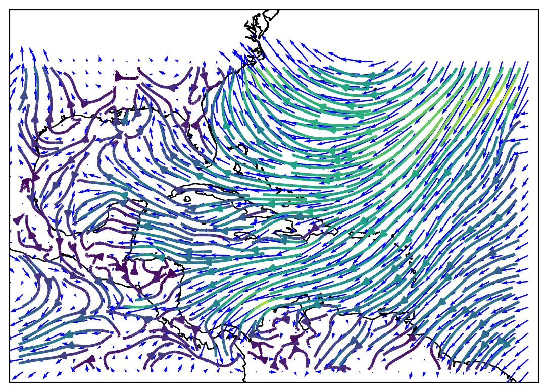
fig = plt.figure(figsize=(20,5))
ax1 = fig.add_subplot(1, 1, 1, projection=ccrs.PlateCarree())
ax1.set_extent([260, 311, 4, 40], crs=ccrs.PlateCarree())
ax1.coastlines()
magnitude = (U10 ** 2 + V10 ** 2) ** 0.5
magnitude.shape
ax1.streamplot(lon, lat, U10, V10, transform=vec_crs,
linewidth=2, density=2, color=magnitude)
ax1.quiver(lon[::5],lat[::5],U10[::5,::5],V10[::5,::5],scale=200.0,color='b',transform=data_crs)
plt.show()
2024-03-01
2024-03-11
<xarray.DataArray 'time' ()>
array('2024-03-02T06:00:00.000000000', dtype='datetime64[ns]')
Coordinates:
    time                  datetime64[ns] 2024-03-02T06:00:00
    reftime               datetime64[ns] ...
    height_above_ground2  float32 10.0
Attributes:
    standard_name:        time
    long_name:            GRIB forecast or observation time
    _CoordinateAxisType:  Time
:::